Holding schools accountable for student growth in a rigorous manner that doesn’t systemically favor one school over another is a vital policy objective. To this end, the Buckeye State has implemented a sophisticated (though not easily understood) value-added model to rate schools by their impact on student growth over time, while ostensibly holding constant other factors that could impact growth.
In previous blog posts, I looked at the correlation between school-level “overall” value-added index scores and (1) the school’s proportion of economically disadvantaged students and (2) African American students. The correlations are low. Evidently, Ohio’s value-added model does not systemically favor high-wealth, largely white schools over poor, largely minority schools. High-poverty schools, for example, can earn high marks on value-added just the same as high-wealth schools. The school-level value-added results stand in contrast to the state’s raw student achievement component, which disadvantages schools with mostly needy students.
In this post, I look at the changes that Ohio has made in its value-added system, and what the distribution of the state’s value-added output looks like across schools under these revisions.
RECENT CHANGES
This year Ohio made several changes to the state’s value-added system. Previously, Ohio reported a 1-year value-added index score for schools and districts. This lead to some head-scratching results (see our 2010 analysis of the year-to-year “yo-yo” effect). Evidently, to mitigate this problem, the state reported a 3-year composite average—2010-11 to 2012-13—for schools’ overall value-added scores. In addition, the state reported for the first time value-added scores for three subgroups of students: those identified as gifted, special education and those in the bottom 20 percent in achievement statewide. The subgroup value-adds are 1-year index scores.[1]
Meanwhile, Ohio issued, for the first time, A-F letter grades along these four dimensions of a school’s value-added performance. As such, the state has changed how it converts the numerical value-added scores into categorical ratings. The state publishes the categorical ratings on a school’s Report Card and they are part of the method by which Ohio determines sanctions against low-performing schools (e.g., whether students in a public school become EdChoice voucher eligible or for automatic charter school closure).
Under Ohio’s old system, there were three rating categories. Now, under the state’s new A-F letter grading system, there are five categories. The table below shows the conversion of school’s index scores under the two rating systems (Ohio Administrative Code 3301-28-06 establishes the new criteria). The old “met” category has effectively been sliced into three categories (B to D). The new rating categories apply to both a school’s overall value-added grade and to its subgroups ratings.
OVERALL VALUE-ADDED
With these changes in place, what does the distribution of school-level value-added scores and letter grades look like under the new value-added system? Are schools distributed “normally” (i.e., along a “bell curve”)? And what of the distribution of schools’ subgroup scores and letter grades? Lots of A’s and few F’s? The following charts display the distribution of scores and grades along the four dimensions of school-level value-added performance.
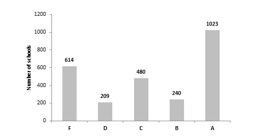
Charts 1A and 1B display the distributions of scores and letter grades for Ohio’s 2,565 schools which received an “overall” value-added score in 2012-13. Schools that contain only grades 9-12 and K-3 do not receive scores, since value-added only applies to grades 4-8. Chart 1A shows that school-level value-added scores form the classic “bell curve.”[2] The distribution, however, is shifted slightly to the right of zero, and the mean is nearly 1. The range of scores is fairly wide—the lowest index score was -27 and the highest was +21.
(Note: Chart 1A, 2A, 3A, 4A display the number of schools that receive a value-added index score within intervals of 1.0. For example, in chart 1A, there were 238 schools that received a value-added score between 0.0 and 1.0.)
Yet, as we eyeball chart 1B, the distribution of the A-F letter grades does not accurately reflect how the underlying data are distributed. Simply, there are far too many A’s and F’s, and not nearly enough B’s, C’s, and D’s. Given the distribution of scores, shouldn’t “C” be the most common letter grade?
Chart 1A: Overall student value-added index scores (3-year average composite), by school building, 2012-13
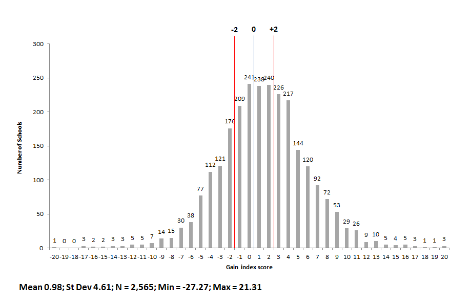
Chart 1B: Overall student value-added letter grades, by school building, 2012-13
SOURCE: Ohio Department of Education, Advanced Users Reports (same source for the following charts)
SUBGROUP VALUE-ADDED
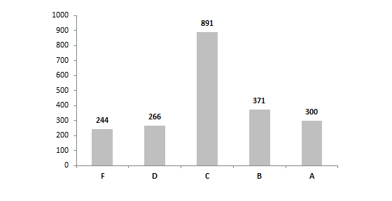
For the first time, the state reported value-added scores and assigned A-F letter grades for three student subgroups. If a school had less than 10 students in a particular subgroup, the state did not report a score or letter grade for that school’s subgroup. Charts 2A to 4B display the distribution of scores and letter grades by subgroup.
Three observations:
1.) Compared to the distribution of overall school-level value-added scores, there is far less variation in the subgroup scores across schools. (The x-axis scale was kept the constant, in order to compare the “spread” of scores, though the y-axis scale is allowed to vary.) Could the different looking subgroup distributions be a consequence of reporting 1-year scores versus a 3-year score for overall value-added?
2.) Compared to the letter grade distribution for schools’ overall value-added results, the subgroup letter grades appear to better reflect their underlying distribution of scores. In all three subgroups, the most frequent letter grade was a “C,” which aligns with the clustering of most schools’ value-added scores around the mean. Still, there seems to be too many A’s and F’s, while not enough D’s and B’s.
3.) Within the subgroups, it appears that the distribution of scores is relatively similar. Nonetheless, it also appears that schools tend to have a slightly stronger impact on low-achieving and SPED students than on gifted students. Consider the higher mean index scores for lowest-achieving and SPEDs (0.22 and 0.16 respectively) compared to the mean gifted score (0.00), as well as the higher number of schools that received A’s for low-achieving and SPEDs (289 and 300 respectively) compared to the number of schools receiving A’s for gifted students (160). Does this indicate that schools typically do better with low-achieving and SPEDs than gifted kids? Or, is there something in the statistical model that slightly boosts schools’ low-achieving and SPED value-adds relative gifted kids?
Chart 2A: Gifted student value-added index scores, by school building, 2012-13
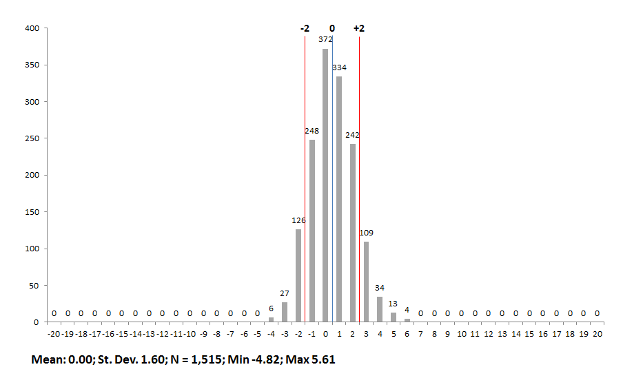
Chart 2B: Gifted student value-added letter grades, by school building, 2012-13
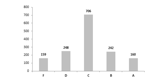
Chart 3A: Lowest 20% achieving student value-added index scores, by school building, 2012-13
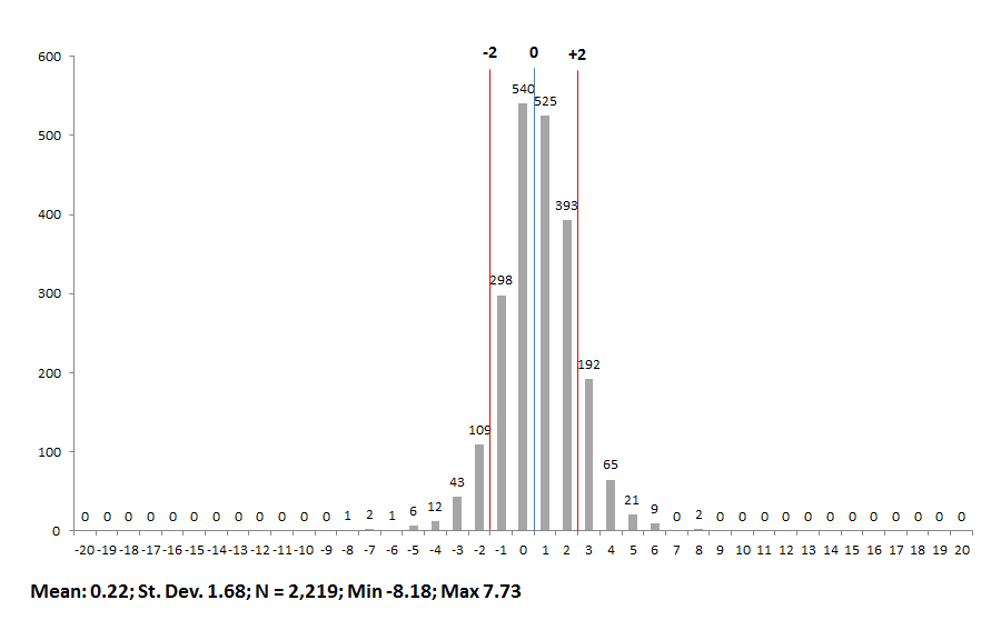
Chart 3B: Lowest 20% achieving student value-added letter grades, by school building, 2012-13
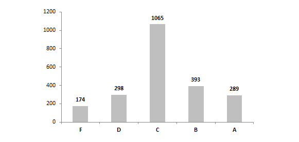
Chart 4A: Special education student value-added index scores, by school building, 2012-13
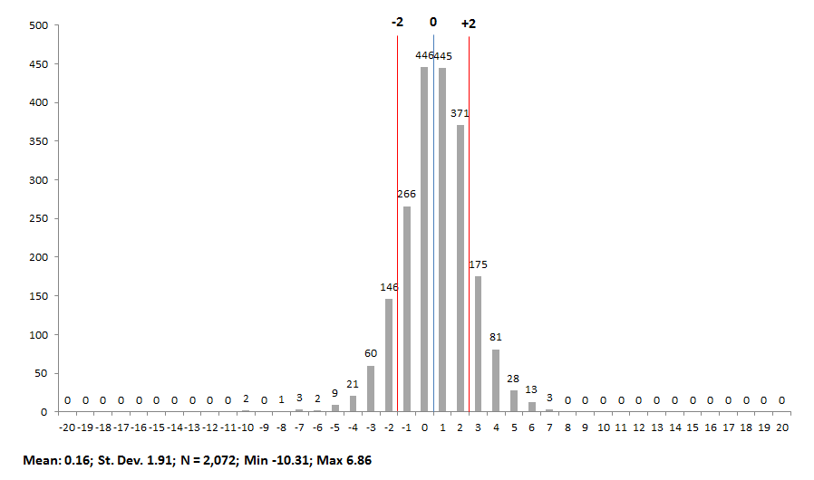
Chart 4B: Special education student value-added letter grades, by school building, 2012-13
It is critical that Ohio gets its value-added system right. Measuring school performance by raw student achievement is simply not enough—it systemically disadvantages poor schools and it creates perverse incentives for school behavior. For example, under pure accountability for student achievement, schools—especially schools of choice—could be incentivized to “strategically” admit higher-achieving students while ignoring low-achievers, in order to raise their achievement score. This type of behavior may be appropriate for businesses in how they hire, fire, and treat adult workers, but it is questionable behavior for how schools educate students.
So, is Ohio’s value-added system on target? On the one hand, I’m fairly convinced that the value-added model does not harm or help schools based on student demography—at least, along the two key variables the state keeps tabs on (economic disadvantage and race). On the other hand, a level playing field for schools isn’t all we want. In my view, we also want a system that produces numerical output that has meaning. I remain skeptical about whether the index scores provide interpretable and practical information for policymakers and school leaders. Additionally, we also want a letter grading system that accurately identifies high- and low-performing schools, based on the distribution of the data. According to the charts, it does not appear that Ohio has gotten this right, especially for its “overall” value-added grades. Finally, in my opinion, we should want a more transparent system of calculating value-added (a topic for another post).
Maybe Ohio is getting closer. But, I’m just not sure we’re there yet.
[1] Once the state has three years of subgroup data, a 3-year “average composite” value-added index score will be calculated for subgroups. An “index” score is the value-added gain score divided by the standard error.
[2] Daniel Koretz, Measuring Up: What Educational Testing Really Tells Us (pg. 79) argues that a properly designed assessment will yield scores that roughly approximate a normal distribution. Does the relatively normal distribution of school-level value-added scores reflect an underlying “bell-curve” of student test scores across the state?

