Editor’s Note: The Thomas B. Fordham Institute occasionally publishes guest commentaries on its blogs. The views expressed by guest authors do not necessarily reflect those of Fordham.
Author’s Note: The School Performance Institute’s Learning to Improve blog series typically discusses issues related to building the capacity to do improvement science in schools while working on an important problem of practice. However, in the coming months, we’ll be sharing how the United Schools Network, a nonprofit charter management organization based in Columbus, Ohio, is responding to and planning educational services for our students during the COVID-19 pandemic and school closures.
For the last two months, my colleague Ben Pacht and I have been writing about the work we are doing at United Schools Network (USN) in response to the COVID-19 pandemic and the subsequent school closure order in Ohio (see here, here, and here). In this fourth post in the series, we’ll summarize some key points we’ve made before, plus offer a few ideas specific to measuring and analyzing remote learning engagement.
We’ve found that there are five foundational components to measuring engagement in this new remote environment. First, we had to work with teachers and principals in order to develop operational definitions of key remote learning concepts. Second, we had to understand the processes that teachers were using to design and deliver instruction. Third, our schools had to have a method in place to collect engagement data. Fourth, we needed to have a tool for displaying engagement data. Finally, we had to have knowledge of variation in order to interpret the engagement data. The ability to improve engagement is built on this foundation.
1. Operational Definitions. As Ben pointed out recently, the education sector doesn't have a unified definition of student engagement now that we've transitioned to remote learning. Operational definitions for concepts such as remote learning engagement require both a method of measurement as well as a set criteria for judgement. At USN, we first developed operational definitions for lesson, feedback, and grading. These three definitions served as baseline expectations for teachers as they transitioned to designing and delivering remote lessons. For engagement, we settled on the following operational definition: “A USN student demonstrates engagement in a remote lesson by completing the accompanying practice set in its entirety.”
2. Understanding Instructional Processes. As we were developing these operational definitions, we were beginning to study each teacher’s remote learning processes. Even with a well-defined set of procedures, there was variability in individual teacher’s processes due to how fast we had to shift to remote learning. The best way to do this study is to visually represent each teacher’s system through a flow diagram. In our second article in the COVID series, we did a deep dive into an eighth grade math teacher’s lesson design and delivery processes. The important take away is that by representing a teacher’s processes visually, you get a clearer understanding where opportunities exist for improving the system and in turn, student engagement levels.
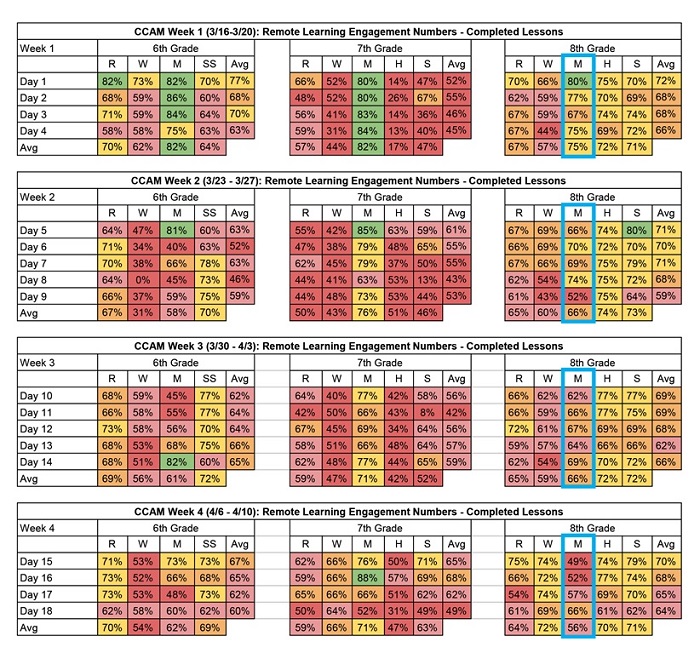
3. Collecting Engagement Data. As a general rule, when it comes to data used for improvement purposes, the more timely the better. Daily is better than weekly, which is better than monthly, as long as we don’t overreact to every data point. At one USN middle school, the leadership team very wisely put a plan in place to track daily engagement levels by student, by grade level, and by subject area within each grade level. A snapshot of these data for the first four weeks (eighteen days) of remote learning engagement is captured in the tables below.

The school has continued to collect these data each day during the closure order. Having the data in tables like this is a helpful first step in the measurement process, but it is tough to determine how things are going by looking at the table alone. For example, if you focus on the highlighted eighth grade math column and ask questions like “Are we improving?”, it is pretty tough to answer. Because of this issue, we’ve been studying a method for displaying our engagement data called a Process Behavior Chart.
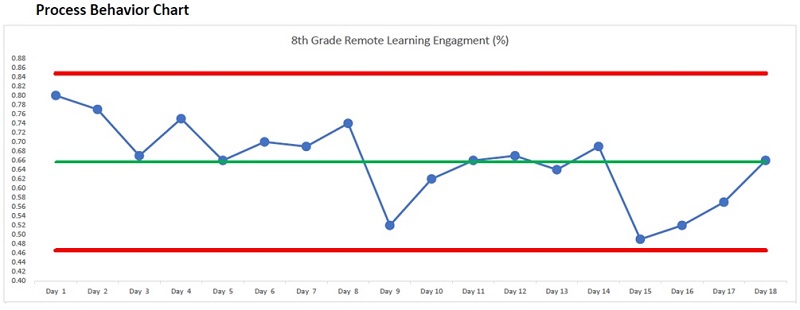
4. Displaying Engagement Data. It’s not an overstatement to say that Process Behavior Charts (PBC) are revolutionizing the way Ben and I are thinking about data analysis. The charts were originally developed at Bell Labs by Walter Shewhart in the 1920’s and then later refined by improvement giants such as W. Edwards Deming. While they can initially be a bit intimidating, they are a powerful tool for both displaying and analyzing data. We’ve included the data for the first eighteen days of remote learning for the eighth grade math class highlighted in the table above in the chart below. Note that PBCs typically have another chart that displays the moving ranges of the data as well but we didn’t include it here for simplicity's sake.

Even if you don’t know anything about Process Behavior Charts, just seeing the data from the tables displayed in this way makes an analysis much more intuitive than viewing the data in the tables alone. (A detailed explanation is beyond the scope of this article, but we suggest Mark Graban’s Measures of Success for a great introductory text to PBCs.) When you combine the power of the Process Behavior Chart tool with knowledge of variation, you can then start making better decisions regarding how and when to improve your data.
5. Knowledge of Variation. Without possessing knowledge about systems and variation, there’s a propensity to misinterpret the data. That becomes particularly problematic when these misinterpretations become the basis for policies and blame. There will always be variation in how well individual students, teachers, or schools perform. The key question is: What is the variation telling us about the remote learning system and about the people that work in it? Unfortunately, our brains have biases that make interpreting data extremely difficult. One such bias is that we tend to default to an assumption that there is a single, specific, and often readily observable reason for why results vary. While every data set contains noise, some data sets may contain signals. Therefore, before you can detect a signal within any given data set, you must filter out the noise. Noise is the routine variation of a data set and is not an indication of a meaningful change. Signals are changes of significance within a data set that need attention. The Process Behavior Chart and the way of thinking that goes along with them allow us to distinguish between noises and signals, and in so doing, allow us to make better decisions. This is the foundation of knowledge of variation.
Returning to the eighth grade math chart example above, we can learn a few important things. First, the data indicate a stable system because the plotted points for the first eighteen days remain between the red control limits. (There are other rules for interpreting the data, but those are beyond the scope of this article.) This means that we can reasonably expect that the engagement levels for this eighth grade math class will produce similar results over time, and now that we have the data through Day 43 of remote learning, that is mostly what we see. Second, in the first eighteen days of remote learning, we don’t see any signals of special events in the data. One indicator of a signal would be a single point outside of the red control limits. This means that there haven’t been any significant events, either in a positive or a negative direction, to attend to in this eighth grade math remote learning system. Third, and most importantly, if we are not satisfied with the overall engagement levels in eighth grade math then we have to work on improving the system that is producing those results. This is very different from an approach where we attempt to improve the people working in the system.
With the five foundational components to measuring engagement in this new remote environment in place at United Schools Network, we can now turn our attention to a structured methodology for improving our engagement levels. This improvement methodology will be the focus of our next article in our COVID series.
John A. Dues is the Managing Director of School Performance Institute and the Chief Learning Officer for United Schools Network, a nonprofit charter-management organization that supports four public charter schools in Columbus. Send feedback to [email protected].


